RoamAway App
Empowering Travelers with Community Insights for Authentic, Sustainable, and Fulfilling Journeys
Project Overview
Independently led the UX/UI design and product development for RoamAway, a bootcamp final project. The app guides travelers from planning to exploration, offering insights to avoid overcrowded destinations, discover off-the-beaten-path activities, and find sustainable options effortlessly.
The Challenge
As a traveler, I was frustrated by the lack of authentic experiences and how mass tourism overwhelms places like my hometown, Barcelona. Most travel apps and influencers only direct people to overcrowded hotspots, missing the chance to offer genuine alternatives. This inspired me to create a platform that guides travelers to hidden, local experiences while promoting responsible tourism.
The Outcome
RoamAway is an app designed to guide travelers from the initial planning stages to on-site exploration, empowering them to make responsible choices and discover authentic experiences. It helps users avoid overcrowded tourist destinations and supports sustainable travel, fostering a positive impact on local communities.
My role
Lead UX/UI Designer
Tools
Figma | Miro | Google Forms
Team
1 UX/UI Designer | 2 mentors
How it works
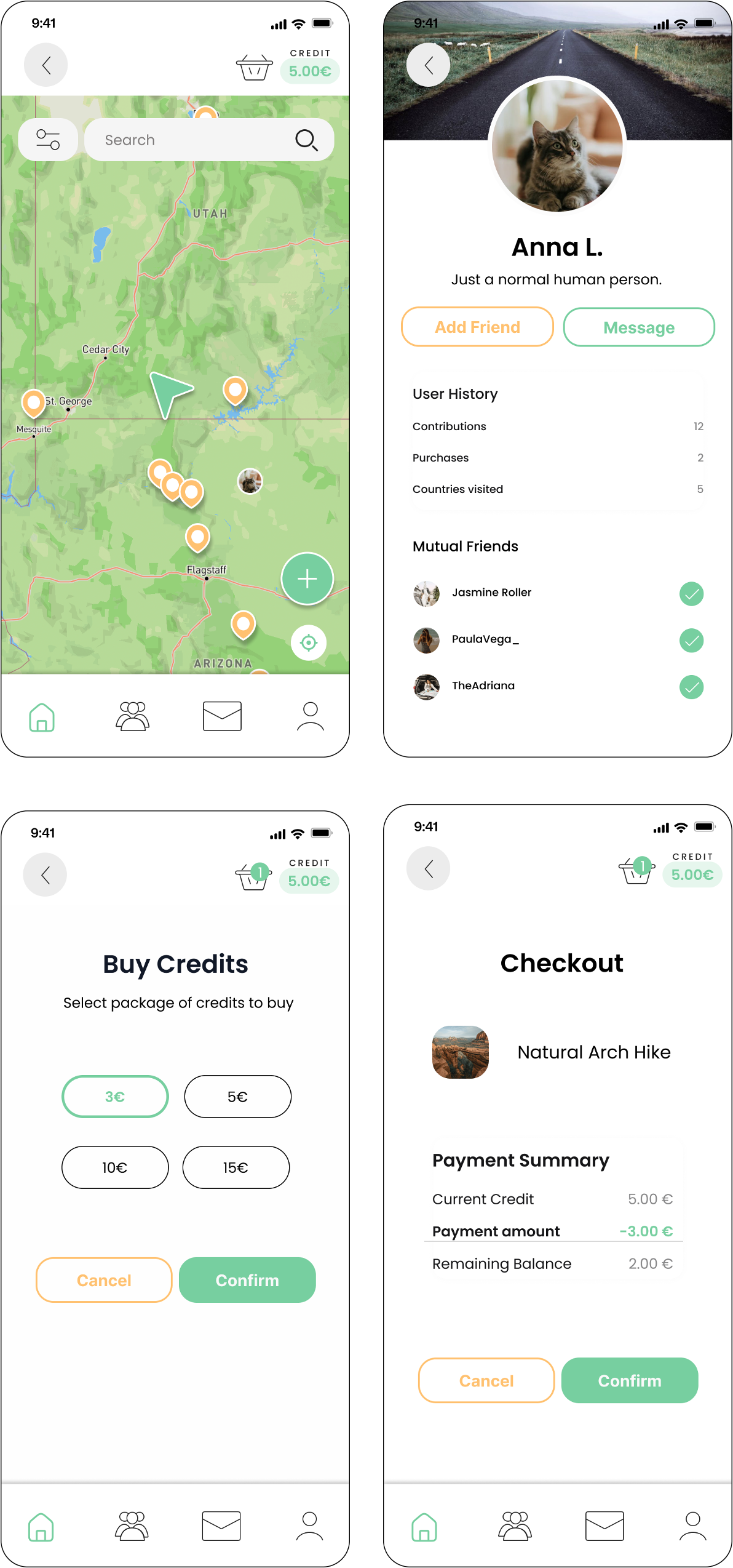
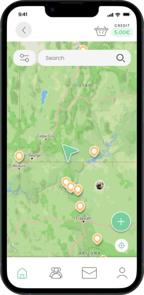
RoamAway offers a range of tools designed to guide travelers through every step of their journey, from planning to on-site exploration. These features help users avoid overcrowded tourist hotspots and find genuine, sustainable experiences that align with their travel goals.
Trip Planning
Provides insights on tourist density, pricing, safety, and sustainable options to help travelers make responsible, informed decisions.
- Real-Time Insights: Check live tourist densities to avoid crowded spots.
- Trending Destinations: Identify trending places in social media that will probably become overcrowded.
- Responsible Tourism Filters: Find sustainable options that support local communities.
On-site Exploration
Offers personalized recommendations guiding users toward authentic local experiences.
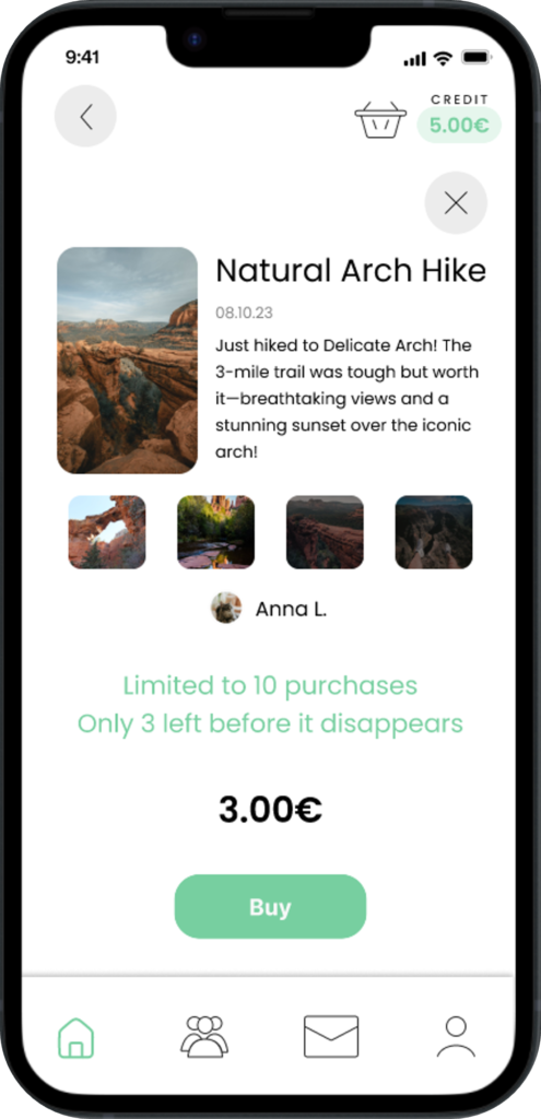
- Credits System: Earn or buy credits to unlock detailed experience info.
- Anti-Bucketlist: Limits bookings to maintain destination uniqueness.
- Community Reviews: Share and read authentic reviews to guide your journey.
- Offline Access: Download maps and essential info for offline use.
The Research
Resarch Approach
To understand the demand for authentic travel experiences and the impact of mass tourism, I employed a mixed-method research approach, including 40 surveys and 6 in-depth interviews with travelers responsible for making travel decisions.
Survey outcomes
77%
Travelers prioritize authenticity when seeking travel experiences.
60%
Travelers primarily seek inspiration from online platforms, including blogs, social media, and booking websites.
65%
Travelers rely on recommendations from family, friends, or locals once they are at their travel destination.
90%
Travelers view massification as the primary challenge in tourism and travel.
Interview Insights
Authenticity
Travelers define authenticity differently—some value local interactions, while others seek remote places or destinations with minimal tourist presence.
When you can access an activity online, it means it's already massified. As a result, it stops being authentic.
User Insight
Mass Tourism concerns
Common worries include the loss of cultural authenticity and sustainability impacts from over-commercialized destinations.
Back in the day, travel wasn't as common... nothing happened. Maybe we should consider something like that again, even if it's not very democratic.
User Insight
Ideation and Concept Development
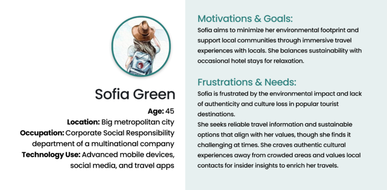
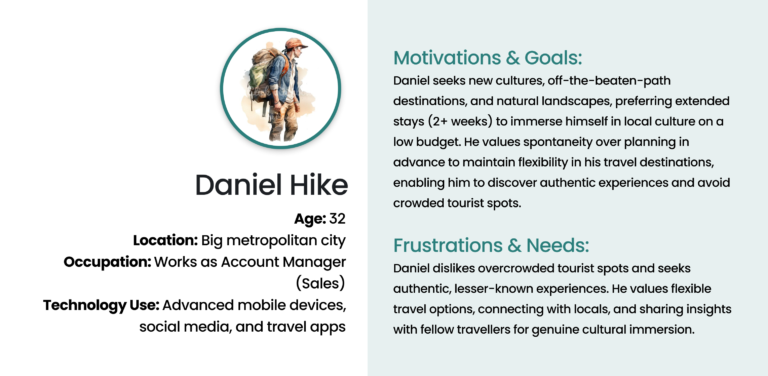
Based on user research, I developed two main user personas focused on authenticity seekers and sustainability advocates, guiding the ideation process. Using techniques like «How Might We» questions and Crazy 8’s brainstorming, I explored ways to help travelers find authentic experiences while avoiding overcrowded destinations and making responsible choices.
The Design Process
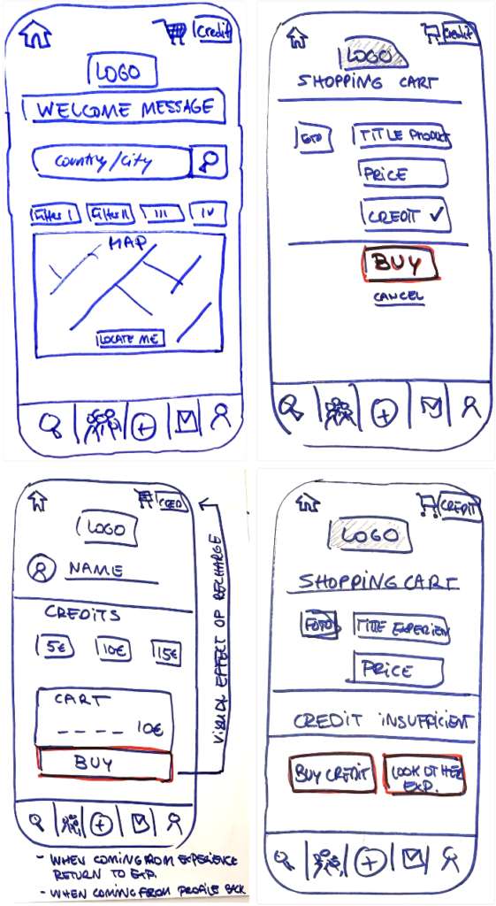
Paper Prototype
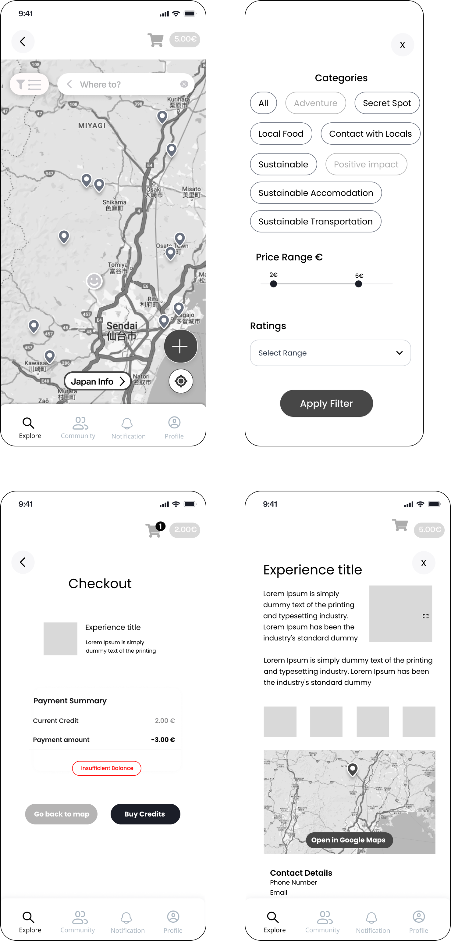
Lo-fi Wireframes
Testing and Prototype
Tested with three experienced travelers; all completed tasks successfully, providing feedback for refinements.
Key improvements
- Enhanced Navigation: Added clear labels to clarify modes.
- Experience Details: Made pricing and creator info visible upfront.
- Onboarding: Improved friend suggestions for personalization.
Results and Impact
Conducted usability testing with three experienced travelers:
- Task Completion: 100% of users successfully completed tasks.
- User Satisfaction: 80% of users found the real-time insights features valuable for enhancing their travel planning.
- Anti-Bucketlist features: Motivated all users to use the app by guiding them toward authentic experiences.
Final Thoughts & Next Steps
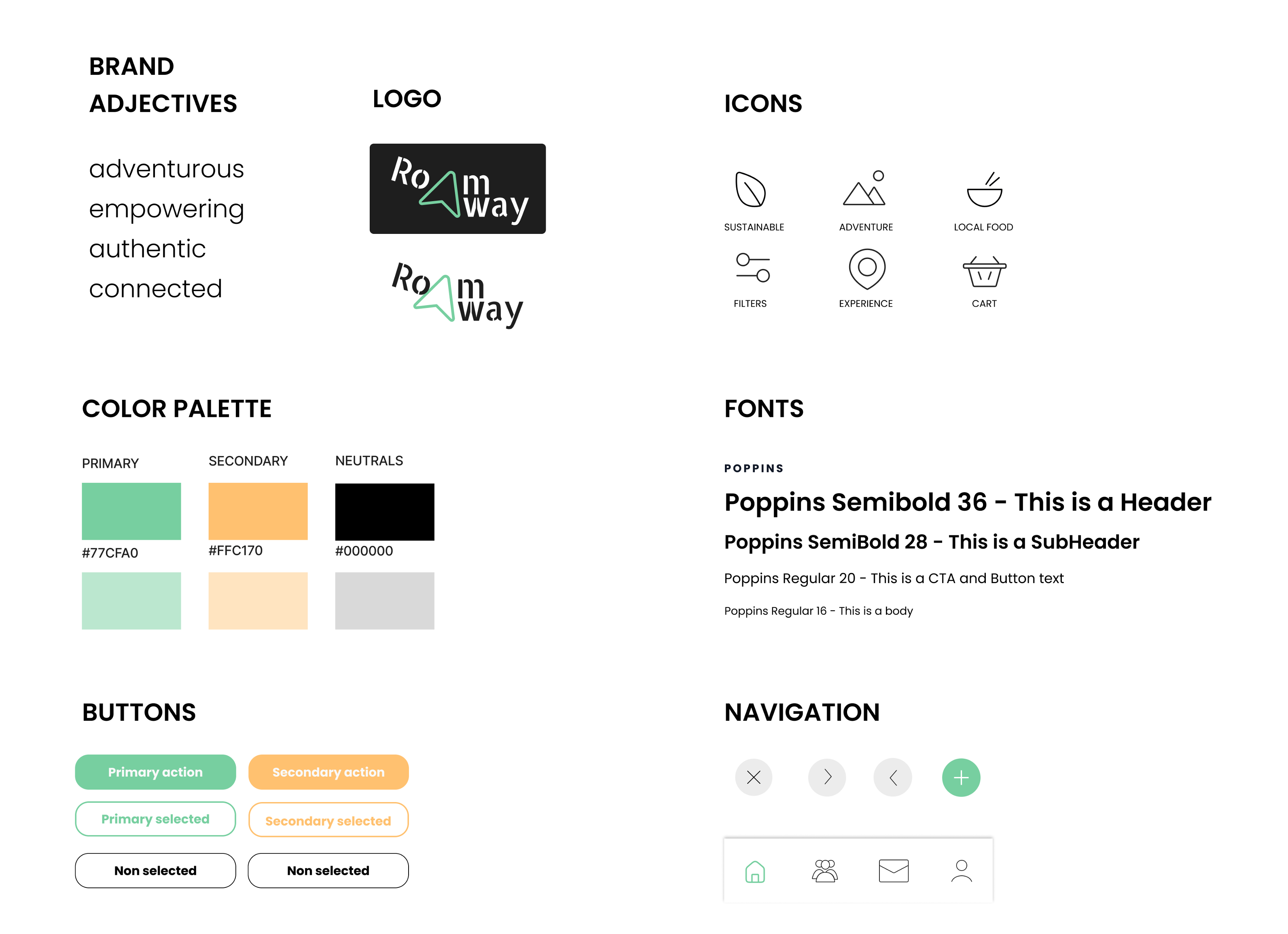
Moving forward, I’ll focus on testing modifications and expanding features for diverse user journeys. This project taught me to stay open-minded, realizing that authenticity means different things to different people. I also learned the importance of a design system for maintaining consistency and efficiency throughout the process.
